A bold brand redesign for Buffalo Wings and Rings
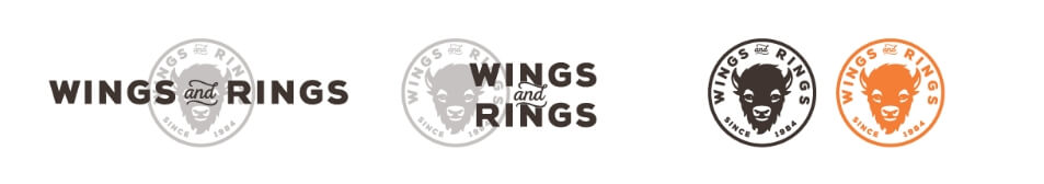
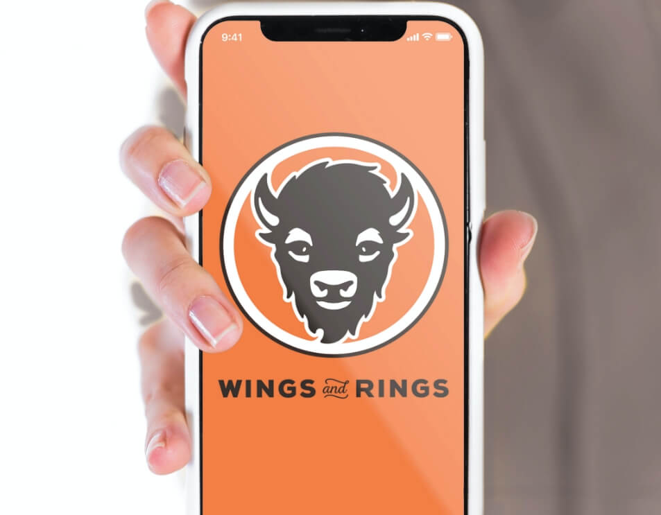
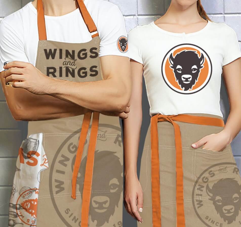
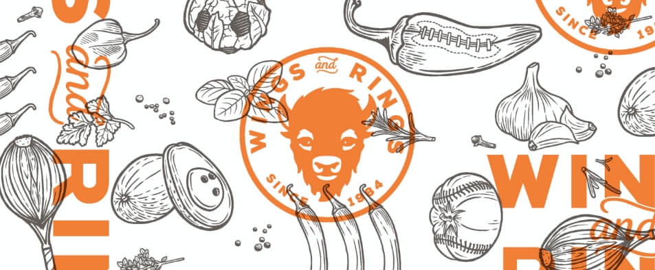
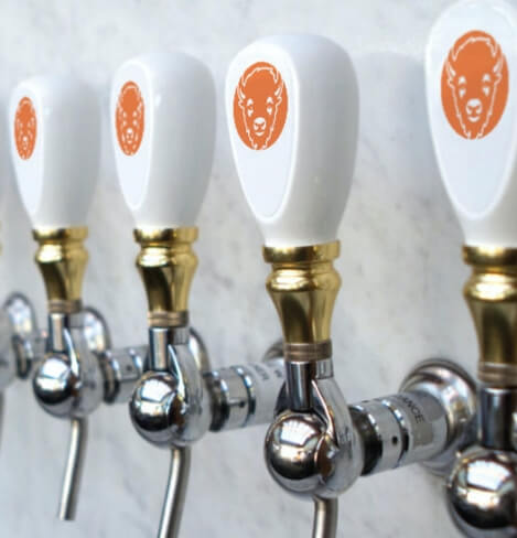
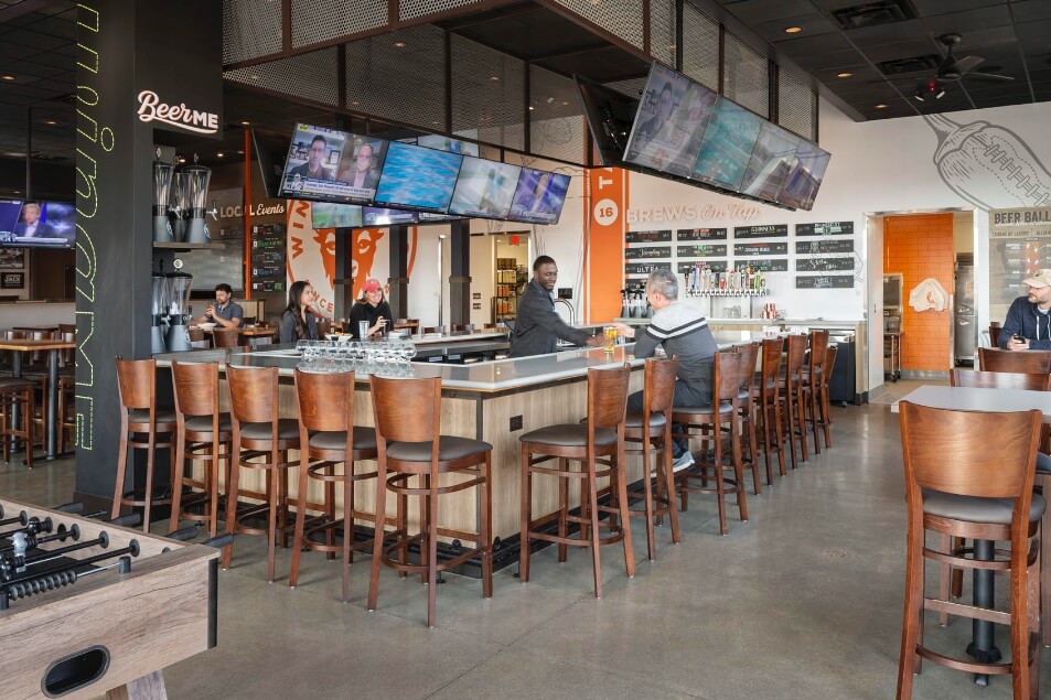
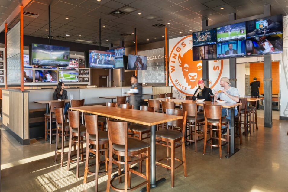
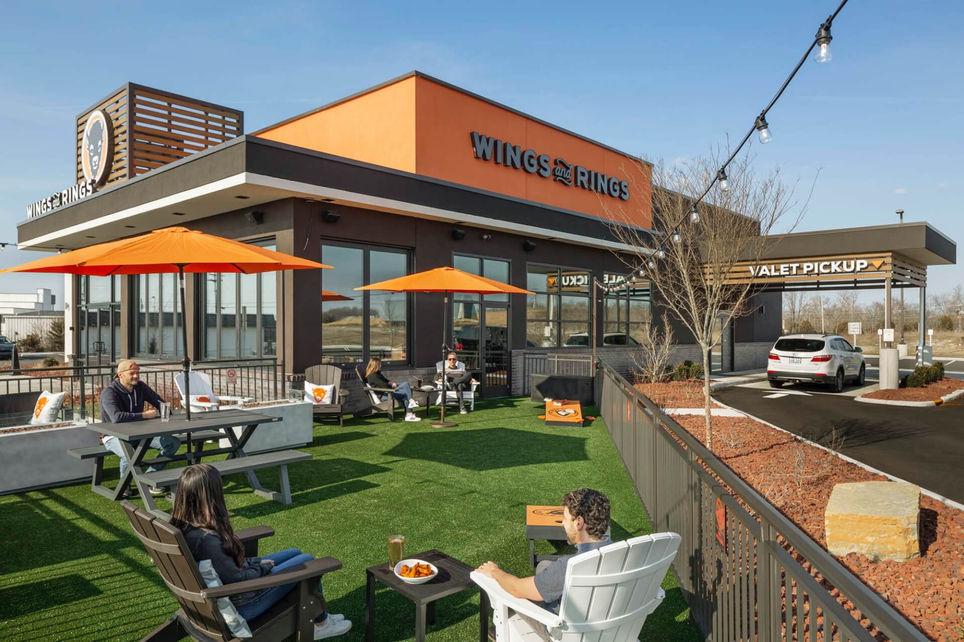
A bold brand redesign drops the “Buffalo” and positions Wings and Rings as a more inclusive, neighborhood hangout, setting them apart from the more boisterous, male-centric competition.
Every touchpoint in the brand experience was considered from menus to uniforms and ultimately, a new store design with outdoor beer garden and valet pick-up for an elevated take out experience. We also developed a menu app that supported a new service model allowing guests to order food from the indoor/ outdoor bar zone.
Our Role:
Brand Identity
Store Planning/Design
Printed Marketing
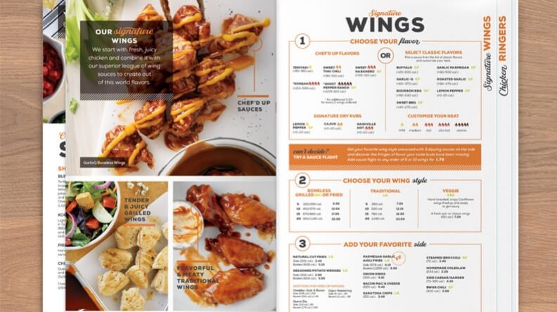
Menus
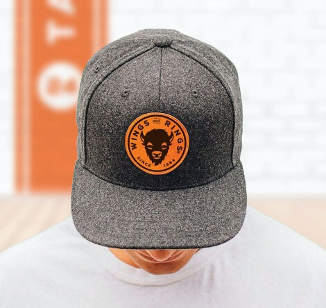
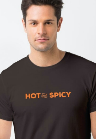
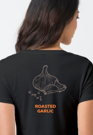
Uniforms
Environmental Graphics
Signage and Wayfinding
UX Design/Digital Menu
Credits:
FRCH Nelson
Project Lead (Store Design and Brand Identity)